The digital era has made marketing easier than ever before. When your official website can become a recurring lead generation tool, a resource to engage prospective customers and a way to develop trust your concern to showcase the best things on your site becomes obvious.How to make visitors stay longer on your website, how to make them return to you again and again are the top questions that do the rounds. In reality an average person spends less than a minute on any site. They scan the sites in search of information and stick to the ones that give them the best. Why should they do business with you? Taking in view the stiff competition in the market, ignoring user engagement on your website can cost you dearly.
To sustain in the market if you are making use of the most cost-effective tool in the market, then try using these 7 magical tricks to establish a bond with visitors and reduce the bounce rate. Conversion occurs when the visitors on your site begins to trust you.
An Appealing and Fast-Loading Website Should Be The First Priority:
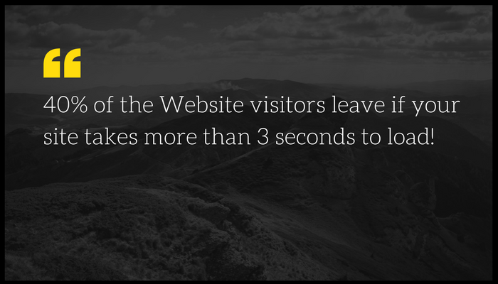
Make sure that your website is an eye-candy to the visitors. It is the first impression. Apart from making your website aesthetically appealing, you should also focus on making it load faster so that it does not become a pain in the back. Make research and follow the top trends of the industry.
Make sure that the design is compatible to your business. Make it a point to form structured content, clean font, solid colors and a non-confusing theme. People stay on your site to read the content that cultivates their interest so make sure that you show your best content where they land with clear fonts.
Easy to Navigate Website Is Always Preferred:
Always keep in mind that visitors come to your site for a reason. It is better not to make it a mission for your visitors or else they would leave your site as soon as they come. The bitter truth is that Internet users are impatient as they are deluged with the choices. Make it easy to find what they have come there for. What you offer, why you should be preferred over others and what your past clients say about you should be easy to find.
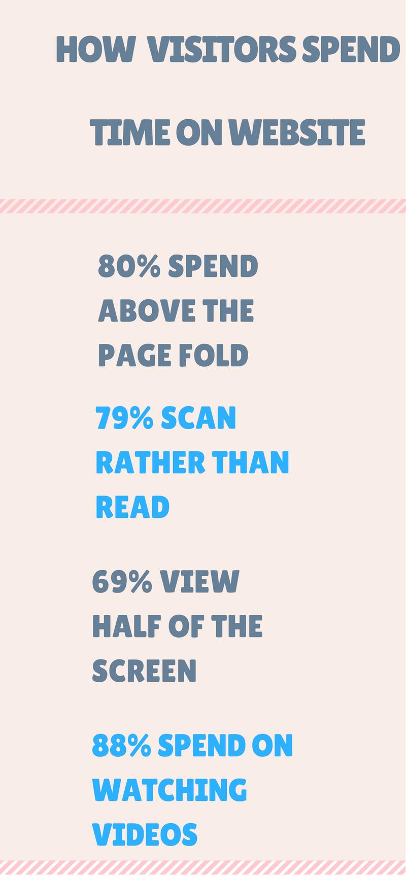
Here is how visitors spend time on your website:
Say No To Interstitial Web pages:
Interstitial pages which appear covering the entire content is no lesser than an eyesore. This kind of advertising fails to work and hence it is not advised. This can affect the visitors to your website and keep them off. Make the landing page neat, easy to find and place your most interesting content on it. Special offers or deals can be shown either on deal bar or in the form of pop-ups when they are about to leave your site.
Incorporating Explainer Video Helps:
It is a fact that people visual content is liked, preferred and shared more than text. So, if you incorporate an explainer video on your landing page you are doing the trick to make the visitors stick to the page. Make it easy-to-comprehend and covering the entire features of your product and service. Similarly, explainer infographics make them wait on your page, read more and keep coming again. Video giving a complete insight is always prefer over the lengthy text because not all have the time and patience to read the entire length.
88% people spend time on videos…see how visitors spend time on your website
Making Use of Heat Maps:
Heat maps expose the most lucrative areas of your site to the visitors. Using this you can find out easily which content is performing better and where they are staying at most of the time. It is not necessary that the most engaging content of your site is improving the bounce rate. It could be an inconspicuous link at the footer or any other unexpected area can also be the most clicked one. You can make the changes accordingly after that. For example, If the link is getting the maximum hits it can be moved to the banner. If your website About Us, why choose us or our services pages are not performing well you can make the modifications.
Resist the Temptation of Auto Registration:
Keeping yourself in the shoes of visitors think how it feels when somebody asks you to register to his site without you having read the content? You need to omit this nagging part to enhance user-engagement and make visitors stay on your site. The contact us page should be shown only when they are lured to have a bond with you. Show them your best content on the landing page, solve their queries, make them know you better and when they finally decide to sign up the contact us form you can display the testimonials of your satisfied clients there.
FAQs Should Be An Essential Part of Your Site:
However good you think your site may be, visitors always want to know more. The better you understand the fact that Internet users voraciously hunt for information the more efficient you would be to make them stay on your site and would be able to develop a bond of trust with them. Visitors are always brimming with queries and satisfying their quests put you in a win-win situation. As per a recent survey, people who place FAQs on their site rank better than the others and can easily come among the top most viewed pages. Also, incorporating this sort of page means you are addressing their needs, educating them and keeping them engaged.
User engagement plays a pivotal role in bringing recurring traffic to your site. Are you aware of the fact that the average time spent by the visitors on your site matters the most in showing you up on the search engines. The more you are concerned about the bounce rate and about the visitors staying on your website, the better your site would perform and you can eventually end up in making your website a lead generation and lead capturing tool. Put your best stuff above the fold means your visitors see the most attractive zone on the screen without their scrolling down or clicking.
Learn to engage, entice and nurture your leads:
https://scrap.me/blog/how-to-build-sales-funnel-get-leads-and-convert-them-successfully/


