Fine! As a savvy you put all your efforts making an attractive website and eventually become able to bring a good traffic also; but, do you think it is enough to generate significant revenue for your business???
Of course, no!
Users might click on your marketing website but less satisfactory information there might divert their mind and push them to close the website. How can you avoid this to save your business??Here comes the concept of ‘landing page’.
What is a landing page?
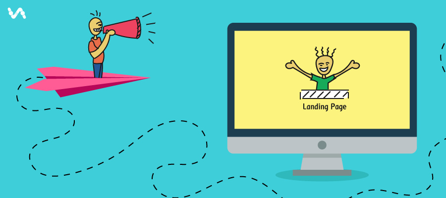
A landing page is that page of website where the visitors first ‘arrives at’ or ‘land on’. The main target of a landing page is to collect visitor’s information through an information gathering form. With the help of this information, website’s landing page is more optimized so that website conversion rate can be increased significantly. Although there are many types of landing pages.
- Click through landing pages
- Lead capture landing pages
- Infomercial landing pages
- Viral landing pages
- Microsites
- Product detail landing pages
- Homepage is landing page
Qualities of top landing pages
For marketers, good conversion rate is the main aim but it demands very much effort too, right? The landing page is has an important role in maximum lead conversion. The eye-catchy look of landing page which is fulfilling the users’ needs can convert even a casual user into the lead or might be into sale. But, in reality it is a tough game but assuredly not impossible. So, what should you keep in mind before designing a landing page? Let’s discuss here:
- Format of landing page
People have a myth in their mind that a landing page should follow a top to bottom approach means all information should be kept in some particular fashion. But, do you think everyone reads up to the end??
If you see the statistics, maximum people will leave or proceed on the page reading a few top lines on your page. Therefore, the most important information should be given the top place on the landing page as it engages users with the website and increases the chance of conversion.
Conclusion: Place important information at the top on landing page format.
- Focused headlines
Headlines are the first thing where users’ eyes falls upon hence it must fulfill the purpose or requirement of the visitor. Confusing or complicated headlines might push visitors to leave the page which, in turns, raise the bounce rate of the website that is not a good signal.
In general, headings that contain figures, a clear intention of solving a problem or negative facts etc attract more visitors to lock with your content.
Conclusion: Headings must contain facts, figures or clear intention.
- Proper image implementation
It’s a psychological fact that people get more attract towards pictures, images or graphics instead of text, so it is a good way to steal attention of visitors through this.
But, images should be introduced very carefully. Suppose if your business is giving a fascinating offer on any physical product then a proper picture of the product must be inserted beside the information. In case, if you are selling any service then an image based on some creative idea can be introduced which shows a proper relevance. Marketers must keep in mind that their images should be unique and new since repeated image can leave an impression of cheap business on user’s’ mind.
Conclusion: A proper image must be inserted along with information that reflects a proper relevance.
- Emphasize on CTA(Click to Action) button
The CTA is the main button from where the actual conversion happens so it must be designed very carefully.
The very first thing is it should be bigger in size so users have not to hover on the screen for finding the button. And also, someone has perfectly said. ‘The bigger the brighter’.
Another important thing is it must be very catchy like ‘download free eBooks’, ‘free download’ etc as people usually get more attract towards the free services in lesser time.
Conclusion: The CTA button should be bigger in size and must reflect an important requirement.
- Live chat facility
People have a number of doubts and a single landing page cannot contain all the informations along or there might be a possibility of ambiguous information. In both the cases, availing live chat facility is the great option.
This is 24/7 online support where the experts of the business directly communicate with online visitors. This is a best way to making visitors more clear about your services and products.
Conclusion: Incorporate a live chat room on your website to understand the user needs.


